
 Vitalii Holben
Responsive Testing: Capture Any Device Viewport
How to capture mobile and tablet screenshots of any website with a screenshot API. Correct viewport sizes for iPhone, iPad, and Android, the difference between device=mobile and just setting width, full-page captures, and Node.js code examples.
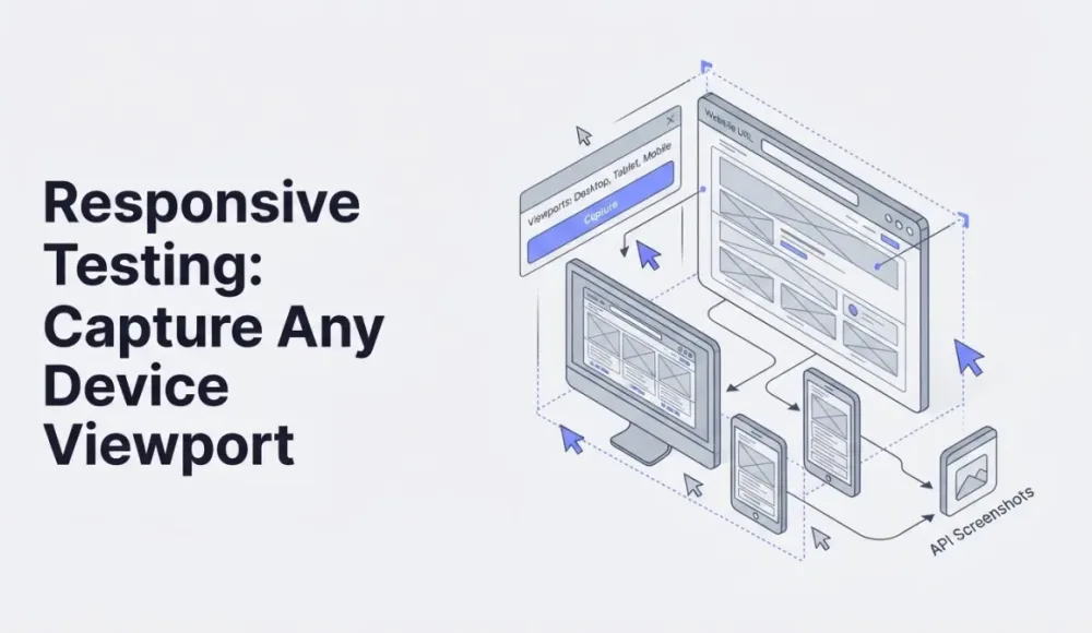
The first time I tried capturing a mobile screenshot, I just set the viewport width to 390 pixels and called it done. It came out looking off: fonts were too small, elements weren't arranged the way they appear on an actual iPhone. Took me a bit to figure out that mobile rendering isn't just about screen width. Device pixel ratio, user agent string, and how the site decides which version to serve all play a part.
In this article I'll show you how to get mobile screenshots that actually look like what a real user sees on their phone. One HTTP request with the right parameters, and you're done.
Three things that make mobile rendering different from desktop
Viewport is the obvious one. An iPhone 14 Pro uses 393×852 CSS pixels. A Samsung Galaxy S24 is 360×780. If you only pass the width, the API falls back to a default height, which is usually fine for viewport screenshots. For full-page captures, height doesn't matter at all because the screenshot extends to the bottom of the page regardless.
Then there's device pixel ratio (DPR). Modern phones render at 2x or 3x density. A website on an iPhone with DPR 3 draws fonts, icons, and SVGs three times sharper than at DPR 1. Skip the DPR setting, and your screenshot will look blurry compared to a real phone. The tradeoff is file size: a DPR 3 capture weighs noticeably more.
And finally, user agent. A lot of sites check the user agent string to decide whether to show the mobile or desktop layout. Without a mobile user agent, you might get the desktop version squeezed into 390 pixels instead of the actual mobile layout with its hamburger menu and touch-friendly buttons.
A basic mobile screenshot: what a simple API request looks like
The simplest possible request looks like this. iPhone 14 Pro width, PNG format:
curl "https://api.screenshotrun.com/v1/screenshots/capture?\
url=https://vercel.com&\
width=393&\
height=852&\
device=mobile&\
response_type=image" \
  -H "Authorization: Bearer YOUR_API_KEY" \
  -o vercel-mobile.png
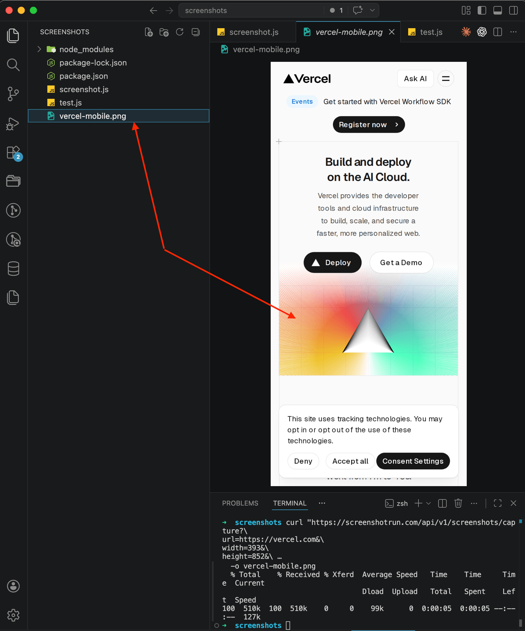
The device=mobile parameter (part of our custom viewport feature) does two things at once: it sets a mobile user agent and enables touch emulation. Without it, Vercel would serve the desktop layout, just crammed into a narrow window.
What you get back is a screenshot that looks like an actual mobile browser. Navigation collapses into a hamburger menu, the "Deploy" and "Get a Demo" buttons stack vertically for the smaller screen, and the whole layout adapts properly.
Picking the right dimensions for common devices
Over time I've built up a cheat sheet of viewport sizes I keep coming back to. All of these are in CSS pixels, not physical ones:
iPhone 14 / 14 Pro: 393 × 852
iPhone SE (3rd gen): 375 × 667
Samsung Galaxy S24: 360 × 780
iPad (10th gen): 820 × 1180
iPad Pro 12.9": 1024 × 1366
For most use cases, two configs are enough: 393×852 for phones and 820×1180 for tablets. Unless you need pixel-perfect accuracy for a specific device, these two will cover the vast majority of mobile users.
iPad example:
curl "https://api.screenshotrun.com/v1/screenshots/capture?\
url=https://vercel.com&\
width=820&\
height=1180&\
format=webp&\
response_type=image" \
  -H "Authorization: Bearer YOUR_API_KEY" \
  -o vercel-ipad.webp
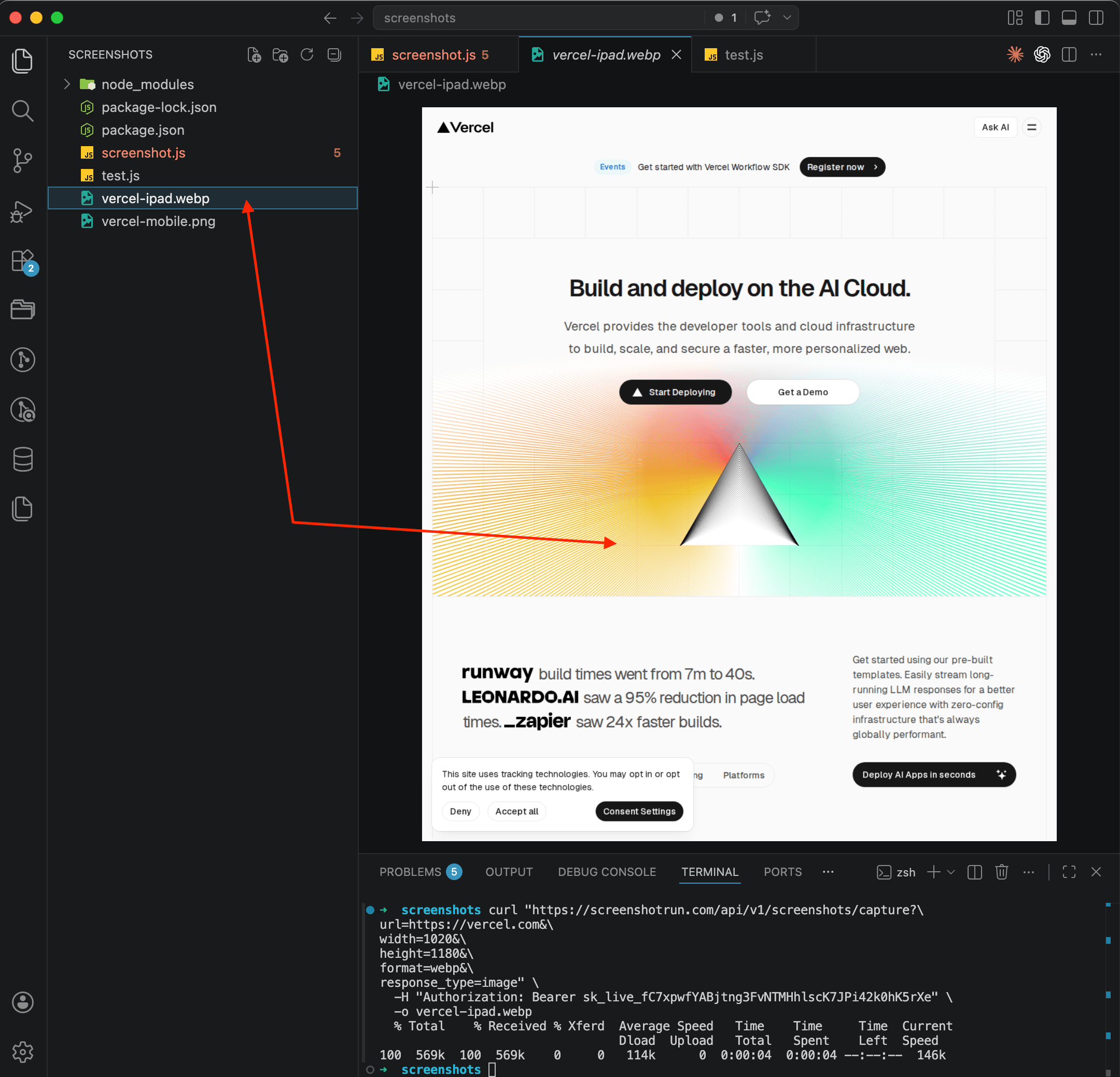
Notice there's no device=mobile here. For tablets, just passing the dimensions is enough. If you add device=mobile, the API will set a phone user agent, and the site might serve the phone layout instead of the tablet one. In the screenshot you can see that Vercel at 820px width serves the desktop layout with full navigation and large headings, which is exactly how most sites look on an iPad.
Mobile screenshot in Node.js in just a few lines
If you're working from Node.js, a minimal script does it:
const fs = require('fs');

const params = new URLSearchParams({
  url: 'https://stripe.com',
  width: '393',
  height: '852',
  device: 'mobile',
  format: 'png',
  response_type: 'image'
});

async function captureMobile() {
  const response = await fetch(
    `https://api.screenshotrun.com/v1/screenshots/capture?${params}`,
    { headers: { Authorization: 'Bearer YOUR_API_KEY' } }
  );

  const buffer = Buffer.from(await response.arrayBuffer());
  fs.writeFileSync('stripe-mobile.png', buffer);
  console.log('Done: stripe-mobile.png');
}

captureMobile();
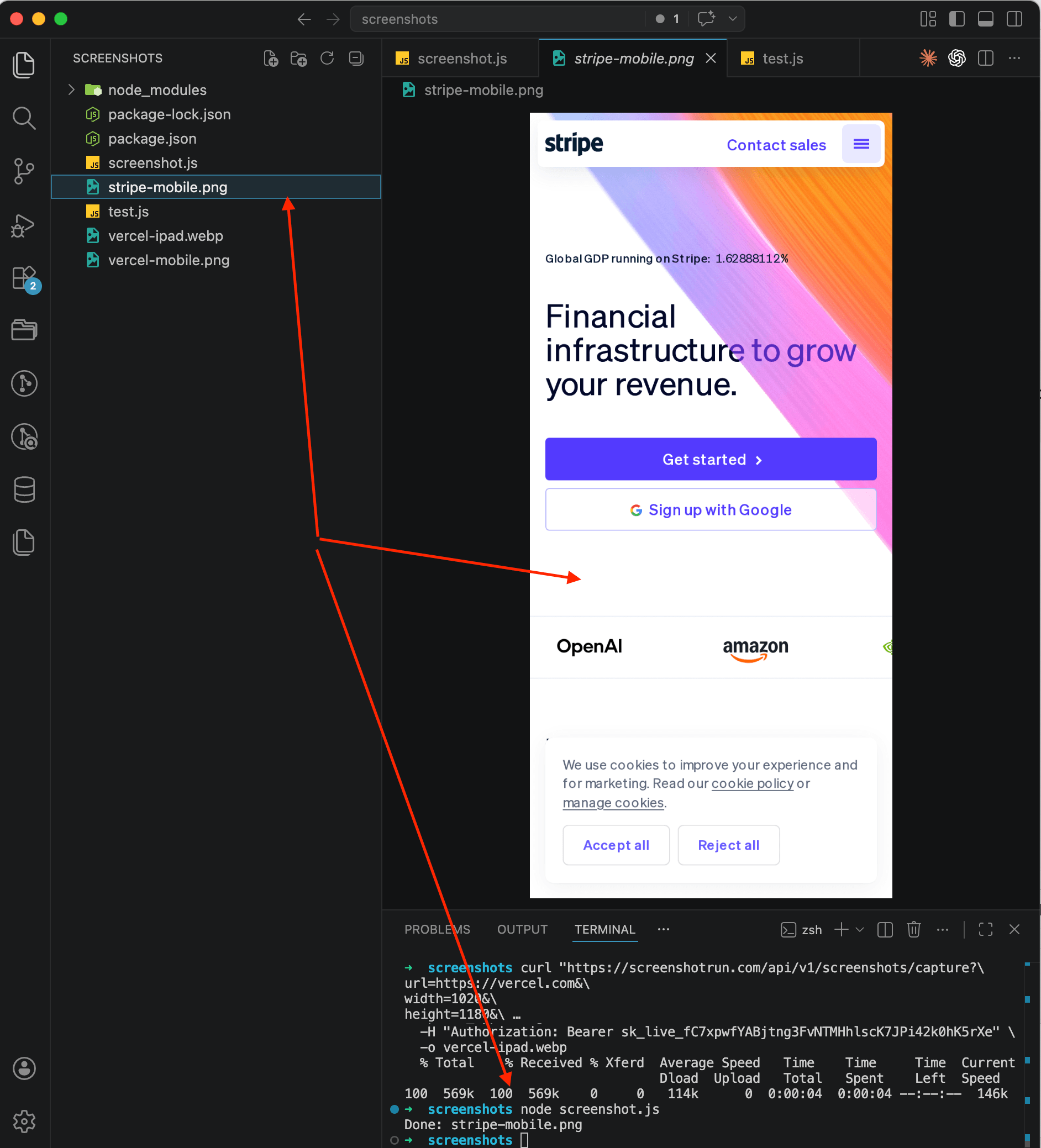
On the screenshot you can see Stripe's mobile version: hamburger menu in the top right, large "Get started" and "Sign up with Google" buttons stacked full-width, client logos lined up in a single column. Looks just like it would on a real iPhone.
The same approach works in Python, Go, PHP, or really any language that can send a GET request. I wrote separate guides for each if you want the full code for your stack. There's also a more detailed Node.js tutorial that covers additional options like custom headers and timeouts.
Full-page mobile screenshots for when a single viewport isn't enough
A viewport screenshot only shows the first screen. But sometimes you need the entire page: for documentation, for QA review, or to show a client how their mobile site looks from the header all the way down to the footer.
Just add full_page=true:
curl "https://api.screenshotrun.com/v1/screenshots/capture?\
url=https://stripe.com&\
width=393&\
device=mobile&\
full_page=true&\
format=webp&\
response_type=image" \
  -H "Authorization: Bearer YOUR_API_KEY" \
  -o stripe-mobile-full.webp
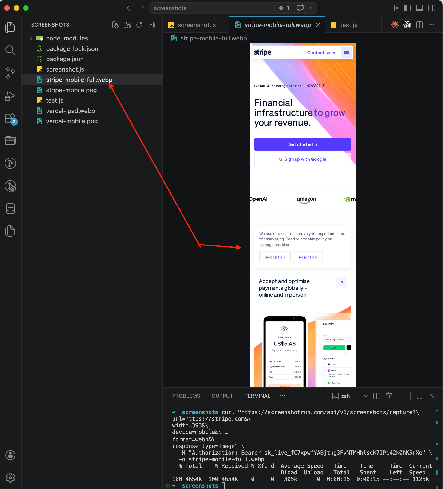
Height doesn't matter here. The API scrolls to the bottom of the page and captures everything. I'd recommend WebP for full-page mobile screenshots because these files can get really long, and a PNG of Stripe's full homepage weighs several megabytes.
One thing to watch out for: pages with infinite scroll (Twitter feeds, Pinterest boards) will keep loading and can produce a massive file. For those, stick with a viewport screenshot at a fixed height.
Capturing desktop and mobile versions of the same pages in one script
A common scenario: you need screenshots of the same pages in both desktop and mobile versions. Maybe for a portfolio, a client presentation, or to keep an eye on your responsive layout. A script that handles both:
const fs = require('fs');

const pages = ['https://yoursite.com', 'https://yoursite.com/pricing'];

const viewports = [
  { name: 'desktop', width: 1280, height: 800 },
  { name: 'mobile',  width: 393,  height: 852, device: 'mobile' }
];

async function capture(url, viewport) {
  const slug = new URL(url).pathname.replace(/\//g, '-') || 'home';
  const params = new URLSearchParams({
    url,
    width: String(viewport.width),
    height: String(viewport.height),
    format: 'webp',
    response_type: 'image',
    ...(viewport.device && { device: viewport.device })
  });

  const res = await fetch(
    `https://api.screenshotrun.com/v1/screenshots/capture?${params}`,
    { headers: { Authorization: `Bearer ${process.env.API_KEY}` } }
  );

  const filename = `${slug}-${viewport.name}.webp`;
  fs.writeFileSync(filename, Buffer.from(await res.arrayBuffer()));
  console.log(`  ✓ ${filename}`);
}

async function run() {
  for (const url of pages) {
    for (const vp of viewports) {
      await capture(url, vp);
    }
  }
}

run();
Two pages times two viewports makes four screenshots. Takes about 10 seconds. If you want to speed things up, wrap it in Promise.all, but for a handful of requests the sequential version is fast enough. And if you're generating these on a schedule, you might want to look into caching your screenshots so you're not re-capturing pages that haven't changed.
Mistakes I've made with mobile screenshots (so you don't have to)
Forgot device=mobile. Got a desktop layout in a narrow window. Site didn't switch to mobile navigation, text was tiny, buttons weren't touch-friendly. Fix is obvious: add the parameter.
Cookie banner covered half the screen. This one drove me nuts. On mobile, those consent banners take up even more real estate than on desktop. I pass block_cookie_banners=true now and don't think about it anymore. I went deeper into dealing with popups in a separate article on hiding cookie banners, ads, and chat widgets in screenshots.
Screenshot loaded with system fonts. Custom fonts hadn't finished loading before the capture happened. Adding delay=1500 gives them time. On mobile emulation, fonts sometimes take a bit longer because the browser simulates a slower connection.
Full-page screenshot missed lazy-loaded images. Images below the fold didn't load because lazy loading only triggered for the visible area. The API handles this automatically by scrolling through the page, but if your site has custom lazy-load logic, you might need to add a delay parameter on top of that.
When a mobile screenshot API makes sense and when it doesn't
The API works well when you need to quickly grab the mobile version of any public site: link directory previews, website preview thumbnails, competitor monitoring, QA checks before deploy, generating OG images for social sharing. If you prefer working from the command line, I also have a guide on taking screenshots with plain curl.
If you need to test a specific physical device running a specific version of iOS or Android, that's a different problem. BrowserStack, LambdaTest, and similar services run real devices for that. A screenshot API emulates a mobile browser through Chromium rather than launching actual Safari on an actual iPhone. For 95% of tasks there's no visible difference, but if your bug only shows up on Safari iOS 17.4, the API won't help there.
Frequently Asked Questions
Three things matter: viewport width and height (e.g. 393x852 for iPhone 14), a mobile user agent so the site serves its responsive layout, and device pixel ratio for sharp rendering. The device=mobile parameter handles user agent and touch emulation automatically.
Setting only the width gives you the desktop version squeezed into a narrow window. The device=mobile parameter also sets a mobile user agent string and enables touch emulation, so the site actually serves its mobile layout with hamburger menus and touch-friendly buttons.
iPhone 14/14 Pro uses 393x852, iPhone SE is 375x667, Samsung Galaxy S24 is 360x780. For tablets, iPad 10th gen is 820x1180. These are CSS pixels, not physical resolution. For most testing, 393x852 for phones and 820x1180 for tablets covers the majority of users.
Yes. Add full_page=true to the request. The API scrolls to the bottom and captures the entire page at mobile width. Use WebP format for these, because full-page mobile screenshots of content-heavy sites can produce large files in PNG.
The API uses Chromium to emulate a mobile browser, not actual Safari or Chrome on a physical device. For 95% of responsive testing this produces identical results. If you need to test Safari-specific rendering bugs on a particular iOS version, you would need a real device testing service like BrowserStack.
Fix "Could Not Find Expected Browser (Chrome) Locally" in Puppeteer
Puppeteer cannot find Chrome? Fix the "could not find expected browser locally" error in Docker, CI/CD, serverless, monorepos, and local development.
Read more →
Fix Puppeteer "Browser Has Disconnected" Error (All Causes)
Read more →
Why Instagram Breaks Your Screenshots (And How to Fix It with Playwright)
Instagram shows two login popups, triggers React re-renders when you hide them wrong, and locks scrollHeight to the viewport. Three problems, three fixes for Playwright and Puppeteer.
Read more →